
For this assignment, I was tasked to use my knowledge of design and take pictures exhibiting different elements in my surrounding environment. Here’s what I found on my day out in town.
1. Balance
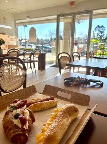
While not perfectly aligned, the placement of the tray with the food items roughly follows the rule of thirds. The sharp focus on the food in the foreground contrasts with the softer focus of the tables, chairs, and the outside scene in the background. This difference in focus helps to anchor the food and prevent the background from feeling too dominant or distracting, contributing to the overall balance.
Tips I tried:
- I thought about how the arrangement of elements would guide the viewer’s eye and create a sense of harmony or disharmony.
- I assessed the overall feeling of the image. Does it feel stable and visually pleasing, or does it feel lopsided or chaotic
2. Use of Space
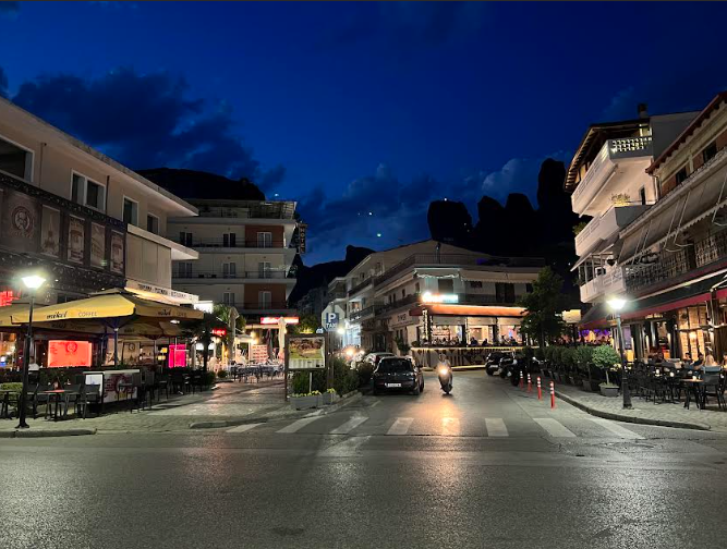
The expanse of the dark night sky above and the empty street in the foreground act as negative space. This negative space provides visual breathing room around the buildings. The verticality of the buildings is balanced by the horizontal expanse of the street and the sky.
Tips I tried:
- I first noted the different areas of space within the image: the foreground street, the buildings, the sky, and the distant background.
- I thought about the interplay of vertical and horizontal space and how it creates a stable and grounded feeling.
3. Color
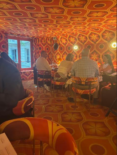
This photograph was taken at a boldly decorated restaurant. From the ceiling to the walls to the furniture, every inch is saturated in a vivid, retro-inspired color palette. The combination of warm reds, oranges, and yellows creates a high-energy environment that feels very immersive and whimsical.
Tips I tried:
- Look for spaces where color dominates, not just accentuates.
- Thinking about the design: What feeling does the color create? How might a designer be using that to influence experience?
4. Typography
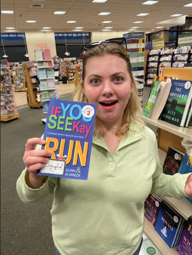
The largest and most prominent text is “IF YOU SEE KAY,” immediately grabbing attention. Below it, “RUN” is also large and bold, creating a clear secondary focal point. This establishes a visual hierarchy, guiding the reader’s eye in a deliberate way. The bright colors of “IF YOU SEE KAY” and the yellow of “RUN” create strong visual anchors that assist the typography choices.
Tips I tried:
- I thought about how the different typographic choices would affect the visual weight of each word.
- I thought about how the reader’s eye would naturally move across the cover.
Leave a Reply